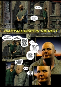
Using MS5/Clip Studio, I revised my first page of “Pale Light In The West”. I wanted a tighter integration of text and art with a more dynamic lettering style and a stronger digital art aesthetic. Using the Akvis blend that I used on my other examples, here I was able to build a better page. There are a lot of things I will want to address – consistent black bubble outlines, a title font adjustment and the idea of a Dave Mack background integration of related elements (prescription drugs seem a natural as Grif is selling them).
The flow is better overall and I’m happier with the text integration but would rework the final panel into a circle, I think. The other question I have is whether I shall keep it in color or use a grey tone?
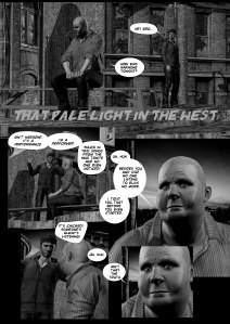
Here’s a quick spit in B/W to contrast. I’ll let them both sit for a while and see what I shall do.

